


Loan Requests
Date
2021
Platform
Mob App
Role
UX Designer
Intro
I led the digital‑experience design for SME loan credit requests within Banco del Pacífico’s mobile app, enabling self‑service product requests.
Impact
Faster application process
10x
Reduced work load of agents
48h
Paperless Adoption
100%
Self-service product request

My Role
User research, usability testing, prototyping and cross-functional team collaboration.
The Challenge
Request
Digitize the SME credit request process in the mobile app to accelerate loan requests for pre‑approved one-person clients and reduce the operational workload for credit officers.
Problems:
Loans are offered via direct calls to customers; if a customer is interested, they must visit the bank in person to continue the process.
The project ran during the final months of the pandemic, a period when in‑person visits became significantly more difficult.
Design Process
Discovery Phase

Journey Map
We identify critical pain points:
Information about this product was not available online the only way to apply for this product was directly in a bank branch.
Knowing the amount of loan that a customer qualified for took several days.
Fear of COVID contagion was at its peak during the pandemic, making branch visits highly anxiety‑inducing.
All application process was paper based leading to unnecessary waste and negative environmental impact.
Customers had to visit the branch multiple times before receiving their money.
The UX design phase was estimated at three months, covering user flows, wireframes, usability tests, and high‑fidelity prototyping.

Define Phase
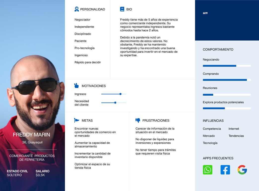
User Persona
Our target personas are small‑ to medium‑sized business owners in Ecuador, typically in their 40s, working in retail or services with only a few staff. They face challenges like limited social security coverage, complex licensing procedures, reliance on informal credit.

Problem Statement
Banco del Pacífico offer SME loans via direct calls, required multiple in‑person branch visits, and relied on manual, paper-based forms. This workflow is slow, resource-intensive and resulted in low number of applications especially during the pandemic, when health concerns and COVID restrictions made physical visits difficult.
User Story
As a merchant, I want to complete a simple, guided online credit application using my basic business info, so that I can quickly access formal financing without spending hours navigating paperwork or gathering collateral documents.
Ideation
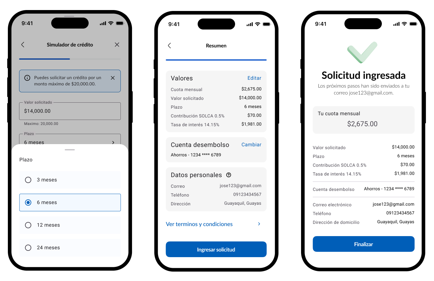
Starting with a User Flow
This first instance allowed to map validation points, possible errors and to have a broad view of the screens to be designed.

Continuing with Wireframes
I synthesized feedback from UX workshops, developer reviews, and testing to define the core components for each screen. That process revealed key pivots:
The "Evaluation Type" screen was removed after product‑definition alignment.
The Product Details screen merged into the Product Select screen for improved clarity and efficiency.

Testing & Iteration
We refined the design to high‑fidelity and tested it with real users. The feedback yielded clear, data‑driven insights—and revealed three key optimizations:
A cluttered dashboard slowed users down, so we streamlined the layout.
We converted a full message screen into an inline info message for clarity.
We adjusted non‑interactive elements to prevent misclicks.

Deliver

Learnings
User Research: Engaging the UX team early on provided key insights into how users interact with similar products in the past to create improved experiences.
Usability Testing: Continuous testing allowed for iterative improvements, ensuring the final product met both user needs and business goals.
Stakeholder Communication: Clear communication was essential in aligning the product’s direction with user and business objectives.
Documentation: Detailed documentation ensured a smooth hand-off to development, optimizing time and quality.