New Visitor Onboarding
Role
Sr. UX Designer
Date
2024
Platform
Tablet (Kiosk)
Intro
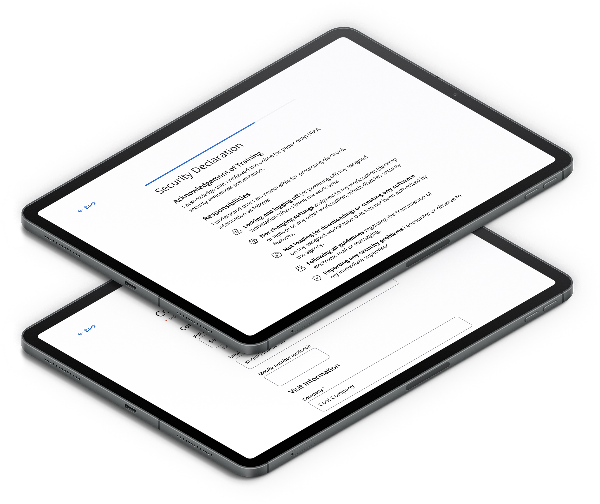
This case study is based on a design challenge from Ecoportal, where they needed to implement new features in their white-label self-service reception kiosk to improve the visitor onboarding experience.
Outcomes


Onboarding
<30 Second
3 Screen
Experience

WCAG
AA/AAA compliance
The Challenge
Initial Request
Enhance the current visitor management kiosk experience (Tablet solution) by embedding the contractor sign up, onboarding and training process in the check-in flow.
Current system features
Visitor arrival notifications
Visitor and contractors check in and check out
Contractor requirements check (training, approved to be in location)
New features requested
Registered contractor in the system
Detect training completion (location safety/ security training)

Problem:
An IT company is onboarding many new contractors at its location, but the process is still paper-based, making it insecure and unscalable.
Goal
Improve the visitor onboarding experience making the check-in process faster, more intuitive, and less reliant on manual input.
My Role
I worked independently designing the end-to-end visitor onboarding experience for their white-label self-service kiosk.
Design Process
Discovery Phase
Benchmarking
This analysis focused on a worldwide selection of best-in-class brands offering Check-In solutions.
Features offered by competition:
Live all assistance during Check-In
Login through QR scan (using own device)
Photo scan
Interactive Map
Multiple Languages
Digital Badge and Printing

User Persona
The user persona was particular in the sense that this was a white-label product targeting a broad audience. This product may be used by any type of company aiming multiple type of users.
I certainly knew that the product will be used by two profile of users “Contractors” and “Visitors,” which guided the scope to include personas who:
Young and senior adults (25 - 65 years old)
May have good or low vision
Diverse backgrounds
Are English speakers (within the scope of this exercise)
Have varying levels of technological proficiency
Are likely in a hurry and value quick, efficient processes
Pain Points and Needs:
Time constrains
Frustration with slow processes
Lack of Tech proficiency
Difficulty reading small text
Future iteration consideration:
Assisted Guidance
Language Options


Journey Map (Looking at the big picture)
Mapping the complete journey of our users allowed to identify the following:
Biggest Pain Points:
Before arrival, our visitors experience stress while trying to find the location, parking or even the office.
Current process is manual which makes it more time consuming for both service agent and visitor.
After completing the visit, a slow check-out process might frustrate them.
Opportunities (Future Iterations):
Allow the user to speed up Check-In previous to their arrival and allow them to complete their goal faster.
Make the log-out quick and easy with a one-click option or automatic log-out after task completion to reduce end-of-day friction.

Define Phase
Problem Statement
The current contractor onboarding and training process is manual and paper-based, which is neither scalable nor secure. The IT company needs to integrate contractor sign-up, onboarding, and training verification into the visitor check-in flow, enabling the system to automatically detect contractors, verify training completion, and streamline the process for new contractors.
User Stories
As a contractor, I want to quickly complete my sign-up through the kiosk, so that I can efficiently check in and start my job without experiencing delays.
As a visitor, I want to quickly check in with minimal effort, receive key information about the location, and get a prompt confirmation, so that I can start my visit smoothly.
Ideation
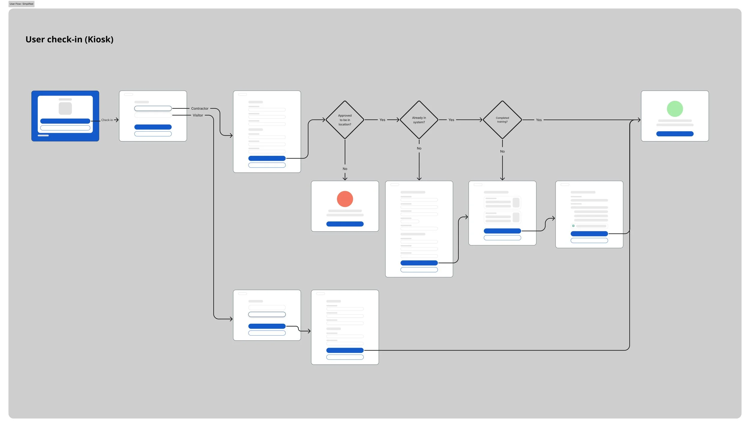
A first draft of wireframes allowed to map out and define decision points, number of screens, sequence and end points.
Key considerations for User Flow
Break down forms into chunks to:
Avoid as much as possible scrolling
Keep everything visible
Avoid possible friction by relying on scroll
Reduce cognitive load per page
Interactive elements large enough to meet distance ratio.
Validation instances that allowed user to skip steps such as “user already in the system”
End point if user is not allowed at the office
Quick User Flow for Visitor Check-In instance
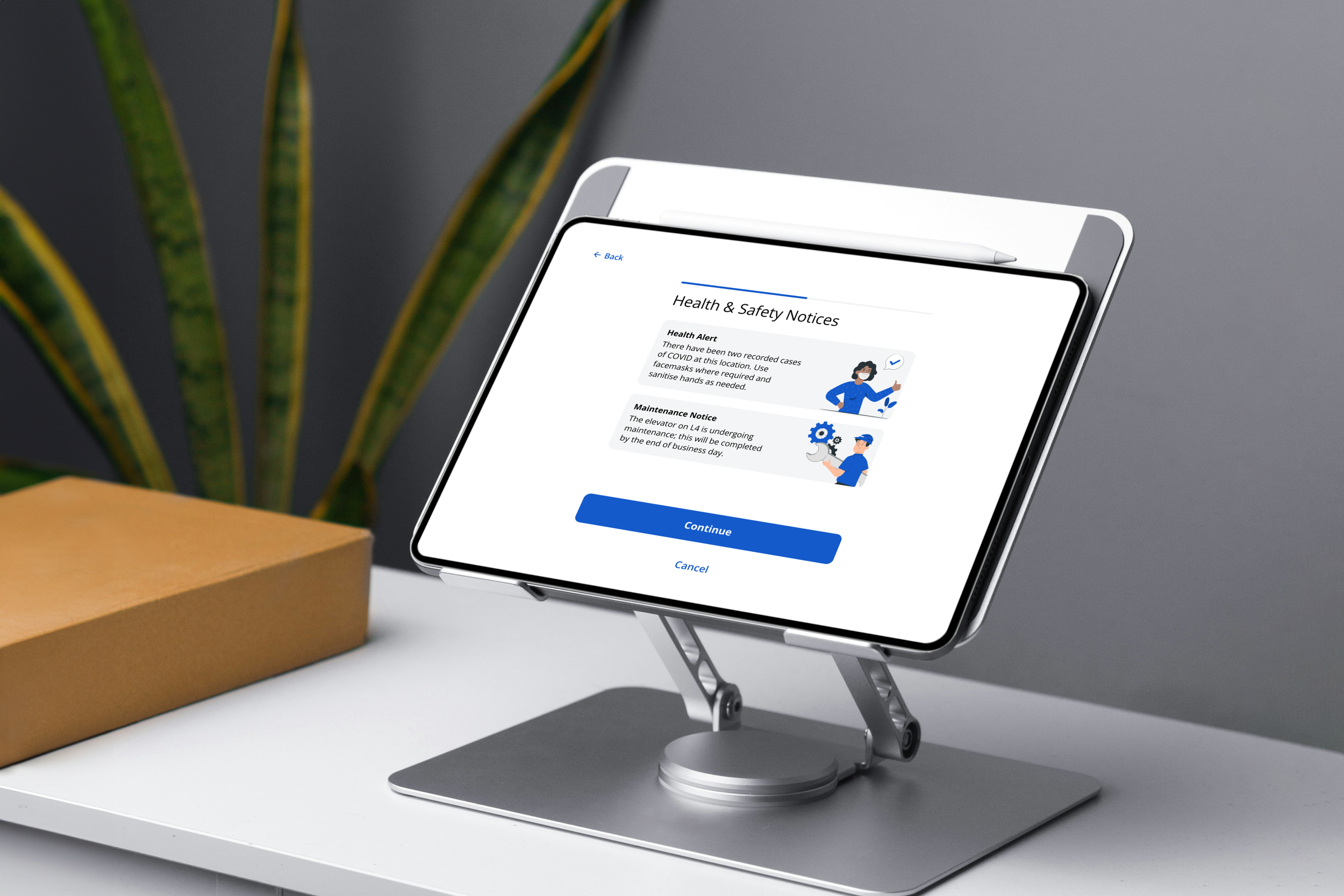
Clear communication when needing additional info and on task completion about next steps
Testing
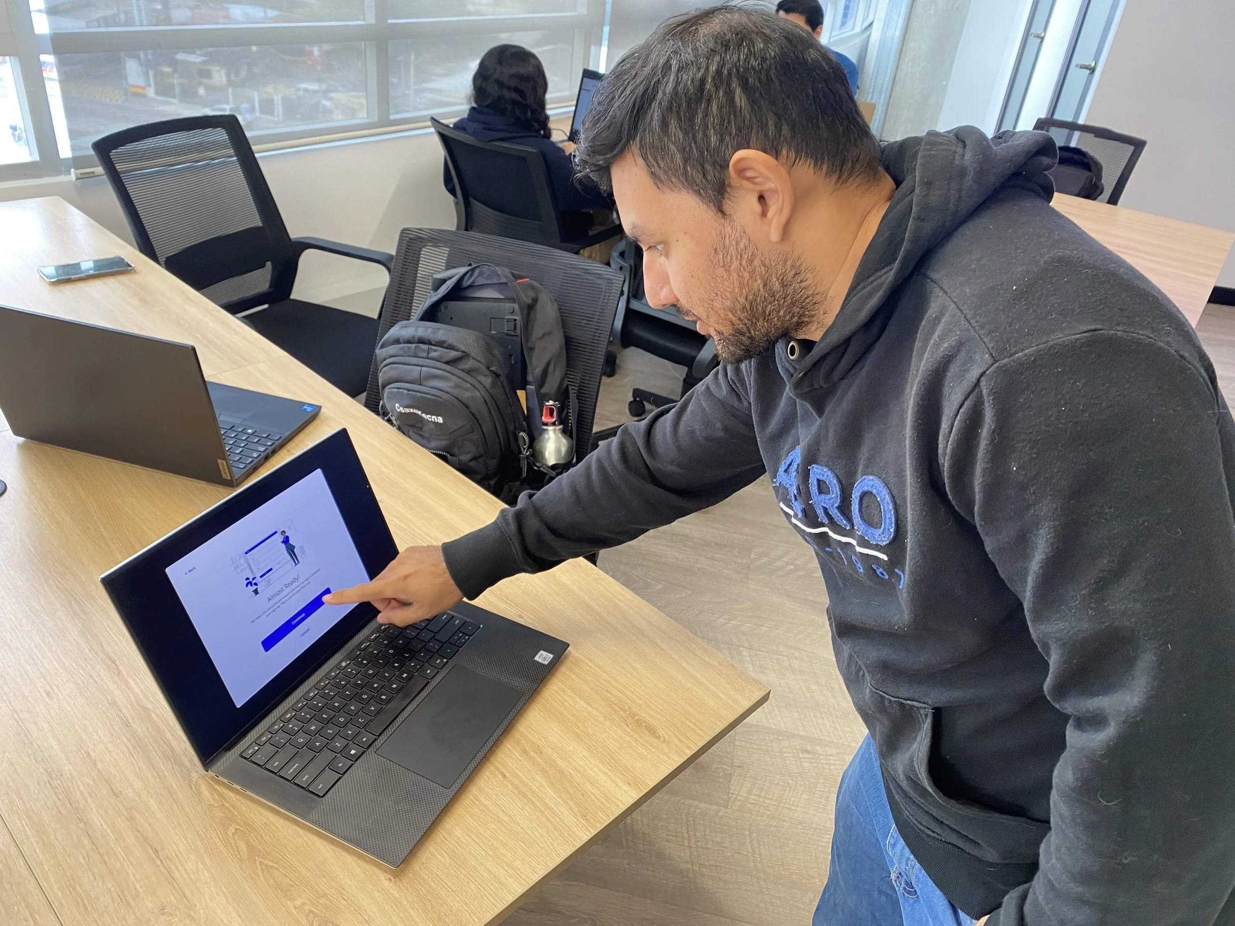
A guerrilla testing session was conducted using available resources. Users simulated interactions with the kiosk device by tapping on a laptop screen displaying the interface at actual size, while assisted clicks were made for them.
It served as a quick exercise to validate:
Copy
Flow logic
Success rates
Affordances
In an ideal practice more in-depth testing should be conducted with real users who closely resemble our user personas, using a tablet device and creating a real scenario setup. We should validate all UX/UI before handle-off.

Deliver
Final User flow and Hi-Fi screens
UI Considerations
Large target sizes (Minimum 48x48 px)
High Contrast Checks ensuring AA and AAA for WCAG
Interactive affordances
Highly readable and versatile font (Open Sans)
Components build using Material DS as base
Simple yet customizable design for easy adaptation to different brand guidelines.
Landscape Design
UX Considerations
Simple language
Minimize overload of screens
Vertical design of forms:
Faster completion rates
Avoid skipping fields that could lead to error states.
Form should have autocompletion fields for instances such as address for a quicker and intuitive solution.

